Per questa attività una traduzione non è al momento disponibile.

Valleys deep and mountains high

Creato: 2018-02-25
Autore/i:
Markus Nielbock (Haus der Astronomie)
Excel_Model

This activity deals with altitude measurements obtained with radar altimetry, a powerful tool used by satellites with low Earth orbits that helps in many different sectors like monitoring of climate changesindicators and disaster management. To simulate the radar operaion, a landscape model hidden inside a box is probed with a rod to obtain the altitude distribution on a regular grid. The data is then represented in three different maps: colour coding, contour map and computer-generated surface map, requiring varying levels of effort for construction.
This activity is part of a larger educational package, the ‘Our Fragile Planet: The Climate Box’ toolkit, and can be linked to the activity ‘The Big Meltdown’.

Materiali
  • Worksheet
  • Landscape models (one model for a group of two to four students)
  • Boxes (one for each model)
  • Wooden skewers (one for each model)
  • Rulers, tape measures
  • Colour pencils
  • Calculators
  • Graph paper, millimetre paper, plotting paper (https://commons.wikimedia.org/wiki/File:Graph_paper_mm_A4.pdf)
  • For activity 3: Computers with Microsoft Excel installed (version 2010 or later)

The landscape model can be anything that provides a good representation of actual scenery, e.g. hills, mountains and river beds. It should be large enough to allow for a representative measuring grid, but not too big so that the effort required is manageable.

One relatively easy way to produce such models is provided in this video: https://www.youtube.com/watch?v=VvA72UqzStA

Another very simple way to create landscape models is combining stiff commercial paper pulp forms. For instance, a kidney dish turned upside down with two pieces of egg carton glued onto it resembles a double-peaked hill.

Figure 1: Commercial kidney dish made of paper pulp.

activities/attach/a17ab86f-a2d4-4c42-b554-4452e4e85eab/KidneyDish.jpg

Kidney dishes can be purchased at a low price, e.g. from local pharmacies, medical supply stores or online stores, like https://www.amazon.co.uk/St-John-Ambulance-Kidney-Disposable/dp/B00TGY71JE/

Nevertheless, it is advisable to look for a hard surface that prevents the skewers from poking into the model during the activity.

In this example, we use a double-peaked hill made of plaster.

Figure 2: Landscape model made of plaster. During the exercise, it is hidden inside the box to the right (own work).

activities/attach/a17ab86f-a2d4-4c42-b554-4452e4e85eab/landscape.png


The model is hidden inside a box of similar dimensions with the measuring grid drawn on the lid. In this example, we have used a 12 × 9 grid. For each grid point, poke a hole in the lid.

Obiettivi

With this activity, students will:

  • learn the principle of probing the height distribution of an unknown terrain as used in radar altimetry from satellites.
  • construct altitude maps by analysing the data they obtained with their measurements of a model landscape.
  • learn how such altitude measurements can help in the investigation of important components of the Earth’s climatic system.
Obiettivi di apprendimento

The students will be able to:

  • explain how a set of altitude measurements can be transformed into a map of the probed object.
  • demonstrate how a two-dimensional map provides information about the three-dimensional shape of a landscape.
  • explain how radar altitude measurements contribute to the understanding of the Earth’s climatic system.
  • demonstrate how linear equations can be applied for interpolation between individual values (in the contour maps parto of the activity).
Contesto

Remote sensing

The term ‘remote sensing’ indicates a measurement technique that probes and analyses the Earth from outer space. Besides classical in-situ methods like weather data analysis, field surveying or sample collection, satellite-based measurements are becoming an increasingly important source of data. Their advantage is the fast and complete coverage of large areas. However, satellite data are not always easy to interpret and need substantial analysis. In addition, they still need to be combined with direct measurements to correct for calibration artefacts.

1621-fig3

Figure 3: Overview of NASA Landsat remote sensing satellites (Credit: U.S. Geological Survey
Department of the Interior/USGS).

The most abundant remote sensing devices are weather satellites. By employing suitable sensors, they provide information about cloud coverage, temperature distributions, wind speed and directions, water levels and snow thickness. Keeping the evolving climate change in mind, these data play an increasingly important role in disaster management during draughts and floods and for climate simulations, atmospheric gas content and vegetation monitoring. In addition, urban and landscape management benefit from satellite data.

The first weather satellites were launched by NASA as early as 1960. In the early 1970s, NASA started their earth observation programme using Landsat satellites (Figure 1). In Europe, France was the first, with their SPOT satellite fleet. This was followed by the remaining European countries in the 1990s after the foundation of ESA, the European Space Agency.


The Copernicus Programme

Since 1997, the USA and NASA have been developing a massive programme to explore the Earth, designated the Earth Observation System, which consists of a large number of different satellites. The European equivalent, the Global Monitoring for Environment and Security (GMES), has been under development since 1998. In 2012, the programme was renamed to Copernicus. Information products for six applications are being derived from the satellite data: ocean, land and atmosphere monitoring; emergency response; security and climate change. The data products are offered to the public free of charge. They are supplied via two branches: space-based remote sensing devices (satellite component) and airborne, ground and marine probing (in-situ component). The core of the satellite component is the fleet of Sentinel satellites built exclusively for the Copernicus projects. They are supplemented by other domestic and commercial partner missions. The first Sentinel satellite (Sentinel 1-A) was launched in 2014. Sentinel-2A and 3-A followed in 2015 and 2016, respectively.

1621-fig4

Figure 4: Computer model of the Sentinel-1A satellite launched on 3 April 2014 (Credit: ESA/ATG medialab).

Radar altimetry

Radar altimetry is a procedure used to identify differences in altitude on different terrains. Radar (radio detection and ranging) is a standardised method for measuring the height of the Earth’s surface. Satellites emit very short radio pulses (a few picoseconds, 1 ps = 10-12 s) with frequencies of several gigahertz which are reflected by the Earth and received in return. The duration of the signal turnaround (ranging) is a measure of the distance between the surface and the satellite. The signal itself also contains information about the composition of the ground that reflect the signals in different ways depending on the conditions.

1621-fig5

Figure 5: Illustration of the procedure of radar altimetry (Credit: CNES/D. Ducros, http://www.altimetry.info/wp-content/uploads/2015/06/methode_en.jpg).

Satellites that apply this kind of measuring technique include Envisat, Jason-1, CryoSat and Sentinel-3A. In contrast to satellites that acquire images at visual wavelengths, radar satellites are largely independent of weather conditions and daylight. Radio waves transmit through clouds and so can probe the Earth’s surface even through thick cloud coverage. Since their wavelength is considerably higher than that of the visual range of the electromagnetic spectrum, the spatial resolution is worse. This disadvantage, however, can be overcome by special measuring and data analysis techniques. In addition, with advances in technology, each new generation of instruments has greater sensitivity and accuracy than the previous generation.

An important application of radar today is determining the varying thickness of ice on sea and land. This information provides clues about the worsening climate change and the amount of water originating from thawing ice. A satellite launched for exactly this purpose is the European CryoSat-2. The data obtained from radar altimetry using this satellite are used to produce topographical maps that provide altitude information.

1621-fig6

Figure 6: A colour-coded altitude map of the Arctic ice cover based on measurements of the CryoSat-2 satellite (Credit: BBC News, 21 June 2011; CPOM/UCL/ESA).

Colour-coded altitude map

Conventional maps are typically two-dimensional bird’s eye views that provide constellations of landmarks and objects like roads, cities and borders. A simple method to indicate altitudes on maps is colour coding (Figure 6). This is done by assigning colours to selected altitude ranges. This provides an overview of altitude distributions with the same spatial resolution as the measuring grid. An example how to produce such a map is given further below.

Contour lines

Particularly in topographical maps, altitudes are represented by contour lines that indicate zones of equal altitudes. An example is given in Figure 7, which provides both altitudes above and depths below sea level.

1621-fig7

Figure 7: Example of a topographical map with contour lines (Credit: Eric Gaba (Sting - fr:Sting), https://commons.wikimedia.org/wiki/File:Mackinac_Island_topographic_map-en.svg, ‘Mackinac Island topographic map-en’, https://creativecommons.org/licenses/by-sa/3.0/legalcode).


One can imagine contour lines as intersections of horizontal cuts through the landscape at equidis-tant altitude steps.

1621-fig8

Figure 8: Illustration of the generation of contour lines indicating altitude. Contour lines can be regarded as the intersec-tions of horizontal cuts through the landscape at equidistant altitude steps (Credit: Bavarian Surveying Administration).

The geometry of the contour lines allows one to derive the characteristics of the landscape from them. The closer the lines are aligned to each other, the steeper is the slope. Closed lines indicate a summit or a trough.

1621-fig9


Figure 9: Closed lines with increasing altitude from the outside in indicate a summit (Credit: Bavarian Surveying Admini-stration).

Constructing altitude maps

Altitude or topographic maps provide information on the geometry of landscapes in all three dimensions, provided the underlying grid of altitude measurements is sufficiently dense. In the example to be used in this section, we assume an area that was probed with an equidistant 4 × 4 grid. The results are given in Table 1. The numbers are without units because they are irrelevant for this example. In reality, they can be given in metres, kilometres or the signal travel time.

Table 1: Grid of simulated altitude measurements. The numbers represent altitudes in arbitrary units.
Column 1 Column 2 Column 3 Column 4
Row 1 1 4 7
Row 2 2 5 8
Row 3 2 7 12
Row 4 3 6 12

The simplest way of producing a map from this is to construct a colour-coded altitude map as shown in Figure 10. The choice of colours can support data interpretation. In this example, a colour map from dark blue via green, yellow and orange up to red is chosen. This corresponds to the colours of a rainbow or the visual light spectrum.

1621-fig10

Figure 10: Colour-coded altitude map based on the simulated altitude measurements. The distribution of colours corre-sponds to the coordinate grid of the measurement. The colours depict the intervals 0–3, 4–7, 8–11, 12–15, etc.

A computer-generated profile of the measurements is shown in Figure 11. It can be reproduced using MS Excel 2010 with the data plotted as a surface chart. As expected, small numbers indicate low altitudes and large numbers correspond to high altitudes. Altitude ranges are also colour coded. The intersections between colours can be interpreted as altitude contour lines. The next paragraphs demonstrate how contour maps can be constructed manually.

1621-fig11

Figure 11: Profile of the simulated measurements. The altitude ranges are indicated as coloured zones. The intersections indicate contour lines.

The individual steps are given in Figure 12. Sketch a represents the regular 4 × 4 measurement grid. The distances between the vertices define the scale of the map. The data obtained at those grid points are added in sketch b to help find the interpolated values in the next step. They should not be added to the real map.

A set of equidistant altitudes should be chosen for interpolation. In this example, we select 6, 9, 12, and 15. The corresponding values are found by linear interpolation – both horizontally and vertically. For instance, 6 must lie between 5 and 7. The proper positions are found by applying a linear equation between two neighbouring data points.


1621-fig12

Figure 12: Construction of an altitude contour map. a) Regular 4 × 4 measurement grid; b) assignment of numbers to the 16 data points; c) horizontally and vertically interpolated data points for a given altitude; d) smooth connection of inter-polated altitudes; e) interpolated contour lines of additional altitudes; f) resulting altitude contour map.

Imagine the distribution of altitude measurements shown in Figure 11 from a side perspective. Two neighbouring data points define a line (Figure 13). Interpolating between individual values can then be done by applying linear equations. The measured values are assumed to be h_1 at position s_1 and h_2 at s_2. The slope of the connecting line is calculated as follows.

1621Equation 1

1621-fig13

Figure 13: Visualisation of the linear interpolation between two data points.

Position s of interpolated value h must lie between s_1 and s_2, which we assume to be separated by ∆s=10 units. This position can be determined by using the previous equation and deriving

1621-equation2

In line with the example given in Figure 13, known variables have the following values:

1621-equation3

We want to construct the interpolated contour line for value 6. This means

1621-equation4

The interpolated data point that belongs to the contour line of value 6 can be found at a distance of 6 units from grid point s_1. This must be repeated for all neighbouring pairs of values. The result is given in Figure 12c. The resulting points are connected with a smooth line, which leads to sketch d. Applying this procedure to all contour line values results in sketch e. The proper altitude contour map is given in sketch f.

In general, interpolating is not allowed between diagonally neighbouring grid points, because the interpolated lines usually do not lie within the plane of the square that is formed by four neighbouring grid points (Figure 14).

1621-fig14


Figure 14: Diagonal lines of a measuring grid that consists of square cells (grey) are generally not in the plane of the square. Therefore, they must not be used for interpolating and constructing contour lines.

Descrizione completa

PREPARATION

The activity should be carried out in groups of two to four. This helps distribute the work (measuring, documenting the data, plotting, etc.).

Remember that the second activity (contour map) is particularly time consuming. So, select in advance map-making exercises that fit your time frame.

Important! The worksheets have to be adjusted to fit the landscape model and the measuring grid envisaged for this activity.

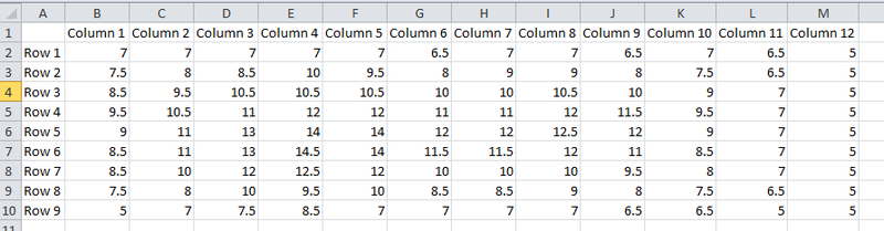
Each group will receive one box with the hidden landscape model inside. Prepare as many work-sheets as there are pupils in the room. The sheets contain background information and a table with empty rows and columns consistent with the grid of measuring positions on the lid of the box. In this example with 12 × 9 points, it looks like an empty version of Table 2.

Each group gets a measuring device (ruler, tape measure) and a skewer.

INTRODUCTION

Introduce the topic of radar altitude measurements with a discussion of the following questions.

Q: How would you measure distances and heights?
A: They will definitely mention rulers, yardsticks, etc.

Q: How would you measure the distance to thunderstorms?
A: When they see lightning, they should start counting. For every 3 seconds, the distance would be 1 km.

Q: Why does this technique work?
A: The speed of sound is considerably lower than the speed of light. Thus, time required for sound to travel is a measure of distance.

Q: Can you also define distances based on the speed of light? What are the units of distance be-tween stars?
A: A lightyear is the distance light propagates within a year. So, if one can measure how long light takes to travel from a source to a receiver, one can infer the distance.

Q: The problem is that clouds can block light. Are there other kinds of light/electromagnetic waves that could be used instead? If they need assistance, mention systems that measure the distances between ships and boats or to airplanes.
A: Radar

Q: How do radar stations work?
A: Signals are emitted, reflected off the target and received again. The signal travel time is used to calculate the distance.

Q: Can you imagine a technology that permits the measurement of the height of the Earth’s surface at various points?
A: Radar technology combined with low-orbiting satellites should be able to do this.

ACTIVITY 1: PAINTING BY NUMBERS -CONSTRUCTING A COLOUR-CODED ALTITUDE MAP (Mandatory)

The students are provided a box containing a landscape model that they cannot see. In addition, they have a skewer, a length measuring device and the worksheet to note down the measurements.

Figure 15: Schematic view of a landscape model inside a box with a measuring grid on top (Credit: O. Fischer, HdA).

activities/attach/a17ab86f-a2d4-4c42-b554-4452e4e85eab/Activity1.png


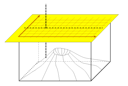
The students use the skewer as a measuring rod. They insert it in each hole or through each grid position and slide it down gently until it hits solid material (Figure 15). If the surface of the model is deformable, tell the students not to use too much force. It is important that the skewer remains perpendicular to the plane of the lid at all times. Then, they measure the length of the protruding end of the skewer and note down the value in the table cell that represents that position on the box. A precision of 5 mm should be sufficient.

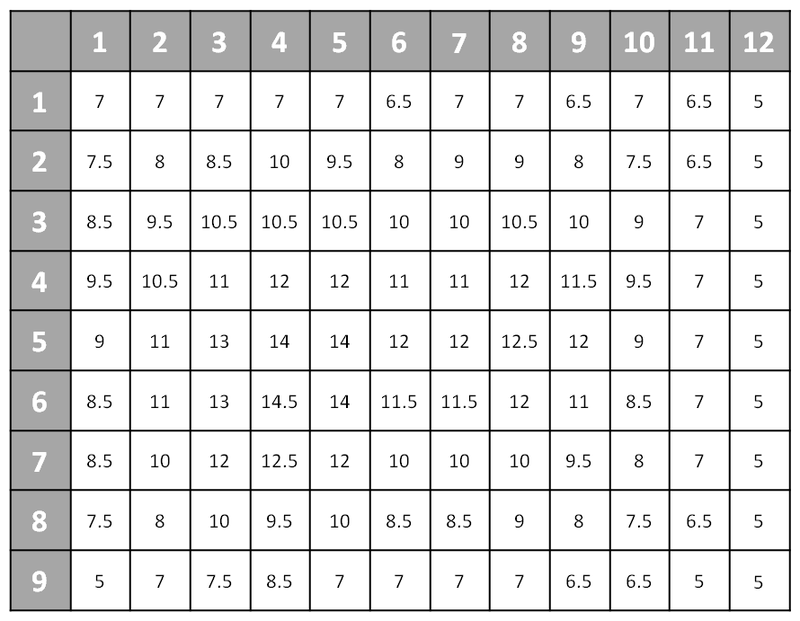
After covering all grid points, they will have filled the table completely. Table 2 shows the result for the current example.

Let the students analyse the result: - What are the minimum and maximum values? - Where is the peak?

Table 2: Table of altitude measurements used in this example.

activities/attach/a17ab86f-a2d4-4c42-b554-4452e4e85eab/Table 2.png

Ask the students if they can easily recognise the topography of the probed item. They will probably deny this. It would be quite difficult to imagine.

Show them the example of the colour-coded ice surface map in Figure 6 or any other topographical map, e.g. in an atlas. Ask the students if they can identify different altitudes. They will probably realise that colour coding is a viable approach to visualise the measurement.

Discuss with the whole group the number of reasonable steps for the colour coding of their own map. Usually, a colour table starting from violet for low numbers through different shades of blue, green, yellow, orange and red is suitable for assigning colours to number intervals.

Let the students now construct a colour-coded altitude map. They can directly colour the table that has the measurements they obtained.

In the example used as template for this activity, the resulting 12 × 9 table contains numbers at 0.5 cm resolution, and this accuracy should be sufficient. Table 2 represents the results of the measurements obtained with the landscape model used in this example. The outcome naturally depends on the model prepared for this activity.

Converting this table into a colour-coded altitude map results in Figure 16.

Figure 16: Colour-coded altitude map derived from the measurements documented in Table 2.

activities/attach/a17ab86f-a2d4-4c42-b554-4452e4e85eab/colourCodedMapExample.png


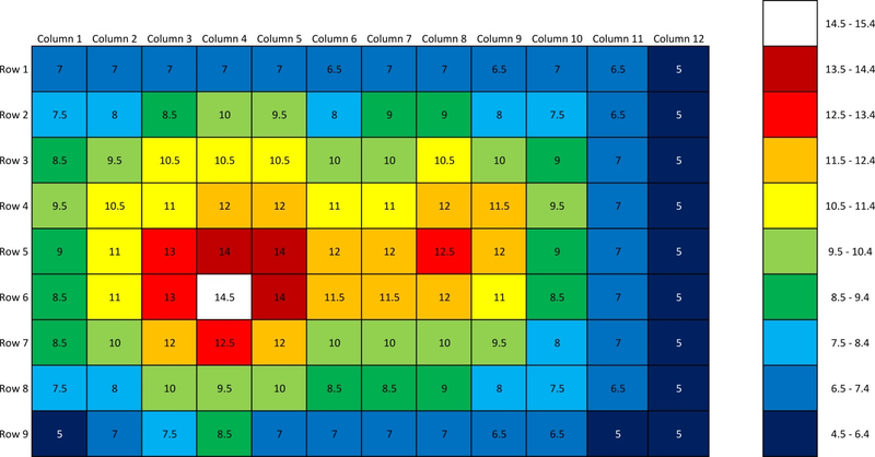
After finalising the map, discuss with the students the probable shape of the models they probed. Let them open the box to compare the hidden structure with their expectations. Did they guess what the prominent features of the model were from the map?

In this example (Figure 16), the two peaks of different heights and the ridge between them are clearly visible.

ACTIVITY 2: CONSTRUCTING A CONTOUR LINE MAP (for advanced students only, can be skipped to save time)

This activity takes quite a long time. If the teacher decides to go through with it, he/she should start with one or a few contour levels to demonstrate the concept. The rest can be left for homework, if required.

Tell the students that they will now learn a different way of constructing maps.

Q: Is the resolution of the map constructed during activity 1 adequate to identify small-scale changes in the height of the landscape model?
A: No, it is not.

Q: Could there be a way to infer the changes in altitude between the positions of the measuring grid? Remind them that no measurement is ideal. There are no infinitely resolved measuring grids. So, how do cartographers produce maps from such information?
A: Within certain assumptions, the altitudes between the grid positions can be derived, e.g. with suitable calculations.

Q: Show them a topographical map with contour lines, e.g. Figure 7. What do the contour lines rep-resent?
A: They are lines of equal height.

Q: How is a mountain peak represented by contour lines?
A: Peaks are identified by a series of nested closed lines.

Q: How is it possible to identify such lines of equal height? Has every point on such a line been measured? Remind them of the interpolation they have studied before.
A: Most of the data points must have been inferred from isolated, discrete measurements.

The map will be constructed according to the instructions in the background information, which the students will also receive with the worksheet.

Hand out the rulers, calculators and graph paper for plotting.

Let the students transfer the measuring grid onto the graph paper as shown in sketch a of Figure 12.

Important: Remind them that each grid point corresponds to a cell in the table of measured values. Therefore, there should be as many intersections as there are cells in the corresponding table.

Let them decide on the number and values of the interpolated contour lines. Perhaps, they will choose the same sample as the one used in activity 1. Let them begin with the largest numbers so that they cover the peaks of the landscape model.

With the equations mentioned in the background information, the students calculate the positions of the interpolated values and add them to their plot. Remind them not to interpolate diagonally. For each value, they should connect the points smoothly.

Figure 17: Contour map of altitudes increasing in steps of one constructed form the values in Table 2.

activities/attach/a17ab86f-a2d4-4c42-b554-4452e4e85eab/contourMapExample.jpg


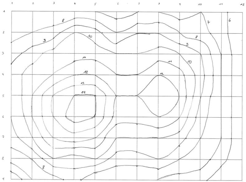
For the example used here, the final result is given in Figure 17.

Q: Compare this (part of the) map with the result from activity 1. What are the similarities and differences?
A: The features should be visible more easily. The contour map appears to have a better resolution than the colour-coded map.

ACTIVITY 3: CONSTRUCT A 3D SURFACE MAP WITH MICROSOFT EXCEL

Provide the working groups with PCs equipped with MS Excel. This activity only works with software version 2010 or later. Only they can produce surface plots. If the teacher chooses to use different spreadsheet software, it is important that it also can produce surface maps.

Q: What other tools can you imagine could produce such maps? What do you think professional cartographers use?
A: Computers, of course.

Tell them that with this activity, they will actually do what cartographers do.

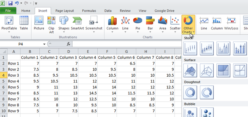
Let the students transfer the table of measured values into a table in Excel (Figure 18).

Figure 18: Excel table of measured values.

activities/attach/a17ab86f-a2d4-4c42-b554-4452e4e85eab/Excel_TableExample.png


The students will work on their own, equipped only with the instructions provided in the worksheet. In order to plot the table as a surface plot, the students highlight the entire table including row and column labels with the mouse and then select Insert *Other charts *Surface (first icon).

Figure 19: The surface plot can be produced via Insert *Other Charts*.

activities/attach/a17ab86f-a2d4-4c42-b554-4452e4e85eab/Excel_InsertMap.png


A new window appears, containing a surface plot of the altitude measurements. This is already a good representation of the hidden landscape model. However, the scaling and the colour coding are initially arbitrary and need to be adjusted.

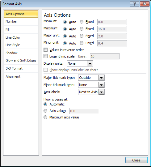
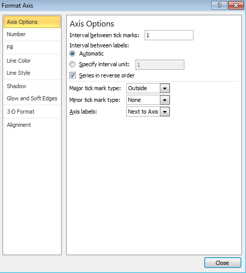
To modify the scaling, first click on the graph window to activate it. Then click on the tick values next to the vertical axis. A grey frame will appear. Then double-click, and a new window pops up (Figure 20). Change the options of ‘Minimum’, ‘Maximum’ and ‘Major unit’ from ‘Auto’ to ‘Fixed’. Then enter the minimum and maximum integer values from the measurement. In this example, these are 5 and 15. ‘Major unit’ indicates the step size for the scaling and the subsequent colour coding, which is 1 in this example.

Figure 20: Axis options window of MS Excel.

activities/attach/a17ab86f-a2d4-4c42-b554-4452e4e85eab/Excel_AdjustScale.png


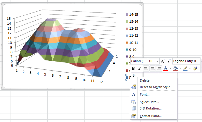
To change the colour coding, click on the legend. Again, a grey frame appears. Then select the colour to be changed by clicking with the left mouse button. Then right-click and a small pop-up window appears that permits colour changes (Figure 21). Select the one that indicates ‘Shape fill’, i.e. the bucket. From the panel, any colour can be chosen. Do this for all entries of the legend.

Figure 21: The colour coding can be adjusted via the legend.

activities/attach/a17ab86f-a2d4-4c42-b554-4452e4e85eab/Excel_AdjustColour.png


Note that the order of the rows initially displayed in the plot is from bottom to top, which differs from the input table. The order can be changed by double-clicking on the row axis and selecting Series in reverse order in the new window (Figure 22).

Figure 22: Dialogue window of MS Excel to change the settings of an axis. The axis representing the rows of the input table should be reversed.

activities/attach/a17ab86f-a2d4-4c42-b554-4452e4e85eab/Excel_AdjustOrder.png


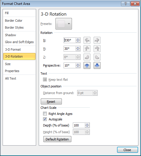
Adjusting the viewing angles on the plot can be achieved by right-clicking on the plot and selecting 3-D Rotation. The new window enables modification of the three angles of orientation (Figure 23).

Figure 23: Options for rotating the surface map along three angles in space.

activities/attach/a17ab86f-a2d4-4c42-b554-4452e4e85eab/Excel_AdjustAngle.png


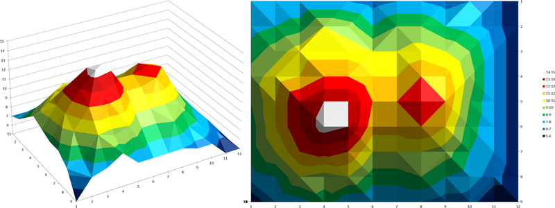
The students will produce two versions that show the data from different viewing angles. One should be right from the top and one should be from an angle that well represents the landscape model (Figure 24).

Figure 24: Surface plots of the altitude measurements used in the example.

activities/attach/a17ab86f-a2d4-4c42-b554-4452e4e85eab/Excel_Model.png


Compare the results with the ones from the other activities.

Let the students discuss the different techniques used to construct a map. How well is the real structure represented? Was the spatial sampling of the measurement sufficient?

CONCLUSION

Discuss the advantages and applications of satellite radar altimetry.

Q: Map services like Google Earth have altitude information stored for each map position. How was that obtained?
A: Via satellites

Q: Why have satellites been used for this? What is their advantage over on-ground measurements?
A: Satellite measurements are faster, more consistent and have wider and denser coverage.

Q: Can you imagine particular applications of radar altitude measurements taken from space?
A: Possible answers are - ice shield monitoring - flood or disaster management - plate tectonics and mountain range monitoring - monitoring water level rise and climate change

Valutazione
  • Let the students explain the concept of a topographical map by describing the altitude distribution in an example map. Let them identify different features like mountains, depressions or ridges.
  • Ask the students how altitudes can be encoded in a map.
  • Ask the students if and how the altitude of an ice sheet changes during melting and how this can be measured.
  • If contour maps will be constructed, let the students solve linear equations to interpolate between numbers.
Informazioni aggiuntive

This activity is part of a larger educational package, the ‘Our Fragile Planet: The Climate Box’ toolkit, and is linked to the activity ‘The Big Meltdown’.

Conclusione

This lesson contains three activities that teach different ways of visualising data from altitude measurements. A landscape model hidden inside a box is probed with a rod to obtain the altitude distribution on a regular grid. This simulates the method of radar altimetry used by satellites with low Earth orbits. These data are translated into three different maps (colour coding, contour map and computer-generated surface map) requiring varying levels of effort for construction. From this, students learn how to interpret such maps. When discussing the applications, they understand that radar altimetry is a powerful tool that helps in many different sectors like monitoring of climate change indicators and disaster management.